The Calendar You've Been Waiting For
DayBack Behaviors, Hacks, and Extensions
Search our actions and extensions library for more options to customize your calendar

Styling a Specific View in DayBack
This example is designed to work with other styling modifications you may want to do. I If you are not familiar with CSS and Styles in DayBack, please this overview of how to change DayBack CSS and Styles.
Can I make customizations to a specific view only?
CSS modifications to the calendar can be formatted to only apply to a specific view. If you’d like your changes only to apply when in the mobile (phone) calendar mode, you can use the following selector:
.mobile-device
The inverse of that, for when viewing the calendar in the full, non-mobile version is:
.not-mobile-device
Adding one of the following selectors to the beginning of your CSS will specify which view to apply the CSS to:
Name of CSS selector -- Corresponding tab in the calendar
.fc-view-agendaDay -- Day view with times down the left side
.fc-view-basicDay -- Simple Day view
.fc-view-agendaWeek -- Week view with times down the left side
.fc-view-basicWeek -- Simple Week view
.fc-view-month -- Month List view
.fc-view-agendaDays -- Month Schedule view
.fc-view-basicHorizon -- Gantt Chart
.fc-view-basicResourceDays -- Resource daily view
.fc-view-agendaResourceVert -- Resource tab with times down left side
.fc-view-agendaResourceHor -- Pivot Schedule (was "Grid" view)
.fc-view-basicResourceVert -- Resource tab, list view
.fc-view-basicResourceHor -- Pivot List
You can see an example of CSS applied specifically to the Horizon view in the following section.
What about changing the popover for just one source/calendar?
You can restrict your CSS mods to just one calendar as well. DayBack uses the calendar name as the class name for the popover (use the case sensitive calendar name with spaces and the “@” sign removed). For example, this will hide the custom actions cog on just the calendar named “Sample Events”:
.SampleEvents .dbk_popover .fa-cog {
	display: none;
}
`The calendar name is also used as a class in this way when drawing an event the calendar (such as how the event appears on the month view before you click on it). For example, this will give events for the Sample Events source a drop shadow:
fc-event.SampleEvents {
	border-color: rgba(0, 0, 0, .3);
	border-width: 1px;
	-webkit-box-shadow: 3px 10px 11px 0px rgba(0, 0, 0, 0.75);
	-moz-box-shadow: 3px 10px 11px 0px rgba(0, 0, 0, 0.75);
	box-shadow: 3px 10px 11px 0px rgba(0, 0, 0, 0.75);
}
I’d like to shade weekends in Horizon view so it’s easier to see where weeks start and stop?
Great idea:
.fc-view-basicHorizon .dbk_day_sat .fc-day-content, .fc-view-basicHorizon .dbk_day_sun .fc-day-content {
	background-color: rgba(200, 201, 204, 0.11) !important;
}
You might also like this mod, which adds a vertical line to the beginning of your week. Works great with the mod above. In your CSS, replace “mon” with your start day.
.fc-view-basicHorizon .fc-mon {
	border-color: rgba(10, 189, 237, 0.22) !important;
	border-left-width: 2px;
}
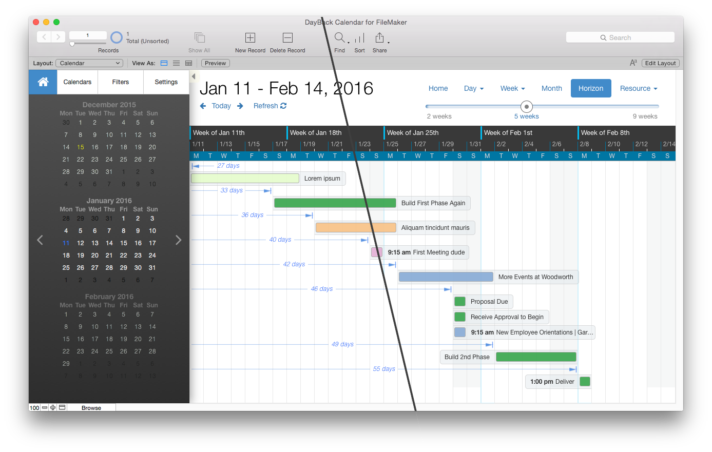
Here is a before and after of what these two mods look like; it’s subtle but I think it makes the horizon view easier to scan at a glance:
Can I change the color of the “none” resource column?
Yes! Using this technique you can assign a color to any resource column simply by replacing “none” with the name of that resource.
.dbk_calendarContent td[data-resource="none"] {
	background-color: #DFECF5 !important;
}
See it in action
Compatibility
FileMaker, Google, Mobile, Microsoft 365, Salesforce
Installation Requirements
Built In