We’re about to launch a new update to DayBack that will include a new look for the sidebar. This new version introduces a ton of cool new features, but it also introduces a new look that some folks might not like. If you don’t like the black header in the new sidebar, you’ll find notes and CSS below that will let you revert to the old style.
Preview
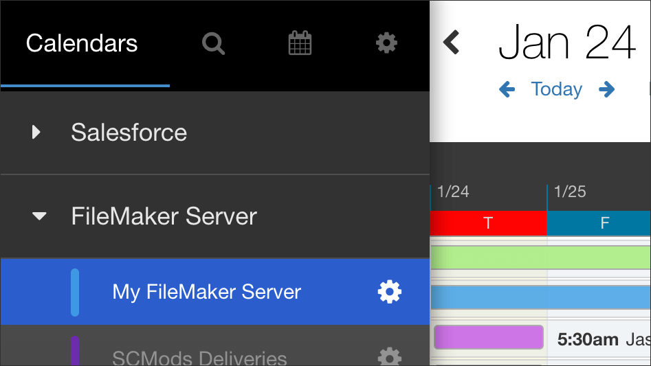
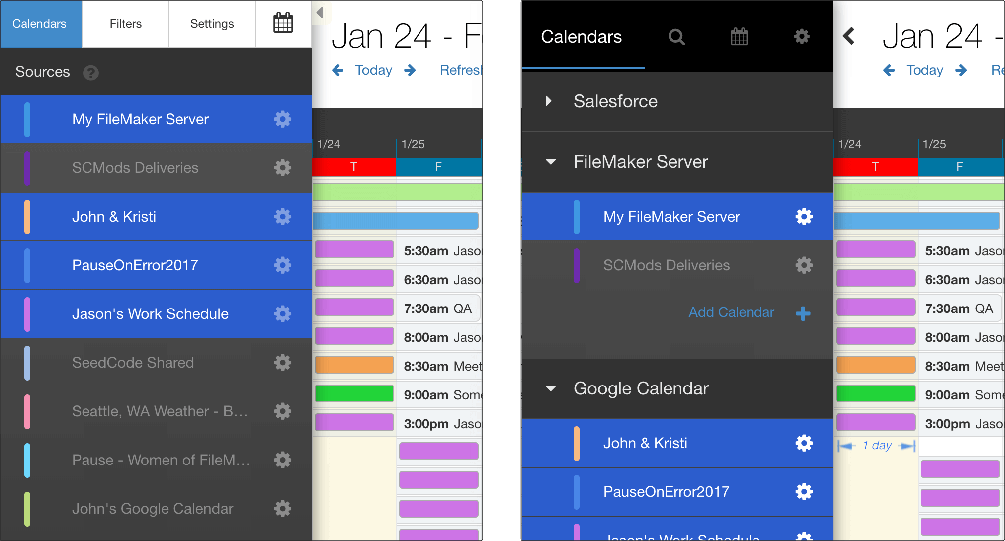
Here’s what the new header will look like. The current version is on the left, and the new version is on the right:
New Features in the Sidebar
- The new black header is much easier to customize with CSS (removing tabs, for example).
- Each source (Salesforce, Google, etc.) now gets their own folder so you can keep your calendars straight.
- Click on folders to turn all the calendars for that source on and off.
- Statuses can now be put into folders so you can more easily select a whole group of statuses by just clicking on their folder.
- Admins can now create new Salesforce calendars right from the sidebar (we wanted to make this more discoverable).
- Basecamp calendars can now get their own default colors in addition to status colors.
- Improvements to the optional tooltips in DayBack.
Changing Back to the Old Header Tabs
If you’d like to revert to the old style, add the CSS below to DayBack and you should be all set. If you haven’t edited DayBack’s CSS before, you’ll find detailed instructions here: changing the calendar’s appearance.
.sidebar .tabPanel {
    top: 48px;
}
.sidebar .tabButtonContainer {
	background: transparent;
}
.tabButtonContainer .is-filtered:before {
   content: "";
   position: absolute;
   top: auto;
   bottom: 4px;
   right: 10px;
   left: 10px;
   height: 3px;
   background-color: #2b5dcd;
   width: auto;
   border: none;
   border-radius: 0;
   margin: 0;
   opacity: 1;
}
.sidebar .tabButtonContainer .btn {
   font-size: 12px;
   height: 48px;
   width: 88px;
   line-height: 18px;
   color: #333;
   background-color: #fff;
   border-color: #ccc;
   border-top: transparent;
   border-bottom: transparent;
}
.sidebar .tabButtonContainer .btn:after {
 	display: none;
}
.sidebar .tabButtonContainer .btn:hover {
   color: #333;
   background-color: #e6e6e6;
   border-color: #adadad;
}
.sidebar .tabButtonContainer .btn.selected {
   color: #fff;
   background-color: #428bca;
   border-color: #357ebd;
}
.sidebar .tabButtonContainer .btn.mini-calendars{
   font-size: 20px;
   width: 57px;
}
.sidebar .tabButtonContainer .btn.filters i {
   font-family: inherit;
}
.sidebar .tabButtonContainer .btn.filters i:before {
   content: "Filters";
}
.sidebar .tabButtonContainer .btn.settings i {
   font-family: inherit;
}
.sidebar .tabButtonContainer .btn.settings i:before {
   content: "Settings";
}
A few more notes for existing users who want to keep the old style:
• If you removed tabs using your own CSS, those tabs should stay gone in the new version as the class names are the same. You likely changed the widths of the remaining tabs to get things to look right, and that’s likely not necessary now: try removing those width changes once you’ve updated to the new sidebar.
• If you made your own styling changes, you can likely recreate those using a combination of the CSS above and the changes you already made. Please let us know if you get stuck.
• The new sidebar puts a blue circle around the filters icon (the magnifying glass) when you have filters applied. We found that users would sometimes forget that they’d applied a filter and then wondered why some events weren’t showing up. This should help.
Leave a Reply