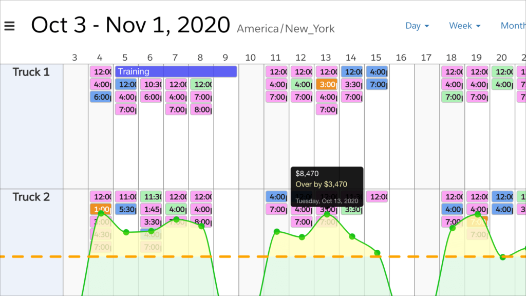
The latest update to DayBack improves charting options when scheduling resources.
On the Pivot-List view, you’ll now find an option to combine all the resource activities into a single curve when plotting activity against a threshold. This means it’s now easier to chart a team’s performance, instead of just the performance of individual resources. Here’s what this looks like in action:
In this example, our “team” is any collection of resources–even if they’re not all in the same folder. And “resources” can be anything in your organization that gets overscheduled: trucks, people, or rooms. Some of our most successful customers use resources for business processes or departments.
Find more about resource scheduling in DayBack here (the video towards the top of the page is a great introduction): Resource & Field Service Scheduling.
To learn more about charting and analytics, look here: Introduction to Calendar Analytics.
Remember, once you get a view/chart set up the way you like, you can save and share that using DayBack’s bookmarks. So take your time building a great set of filters that chart the outcomes you’re most interested in, then save that view so you can check in on your progress. Enjoy!
Leave a Reply