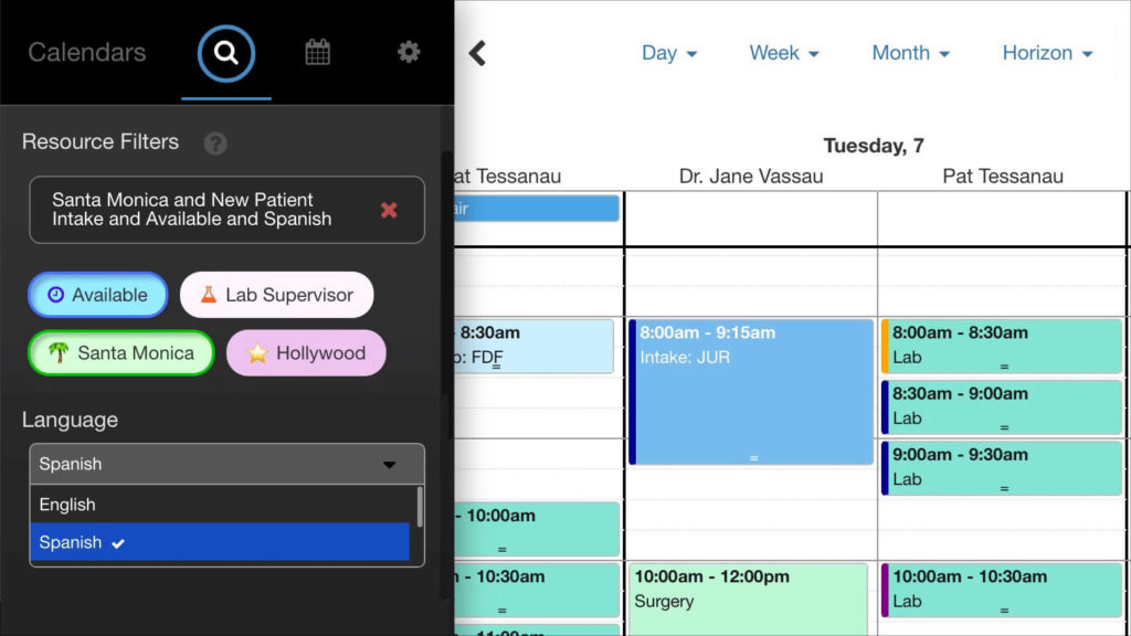
Click-to-Filter: Show Resource Tags in the Calendar’s Sidebar
We’d love to show you the latest addition to our collection of DayBack extensions. This new sidebar enhancement allows you to harness the full power of Resource Tags when filtering your calendar by resource. Resource tags allow you to define a set of skills or attributes for each resource. Attributes can be configured for each of your resources by hand, or they can be pulled in dynamically from Salesforce and FileMaker.
The new extension allows you to add quick filter buttons that quickly narrow down your resources according to a specific skill. You can even create dropdowns of related skills, which can be grouped together for easy access.
If you need to schedule appointments with specific individuals based on a certain combination of skills, roles, or duties, this extension can help you identify the right resource for the job in just a few clicks. If you have different types of workflows for different roles, you can optimize commonly-used filters to match each department’s workflow.
Call Center Scheduling Example
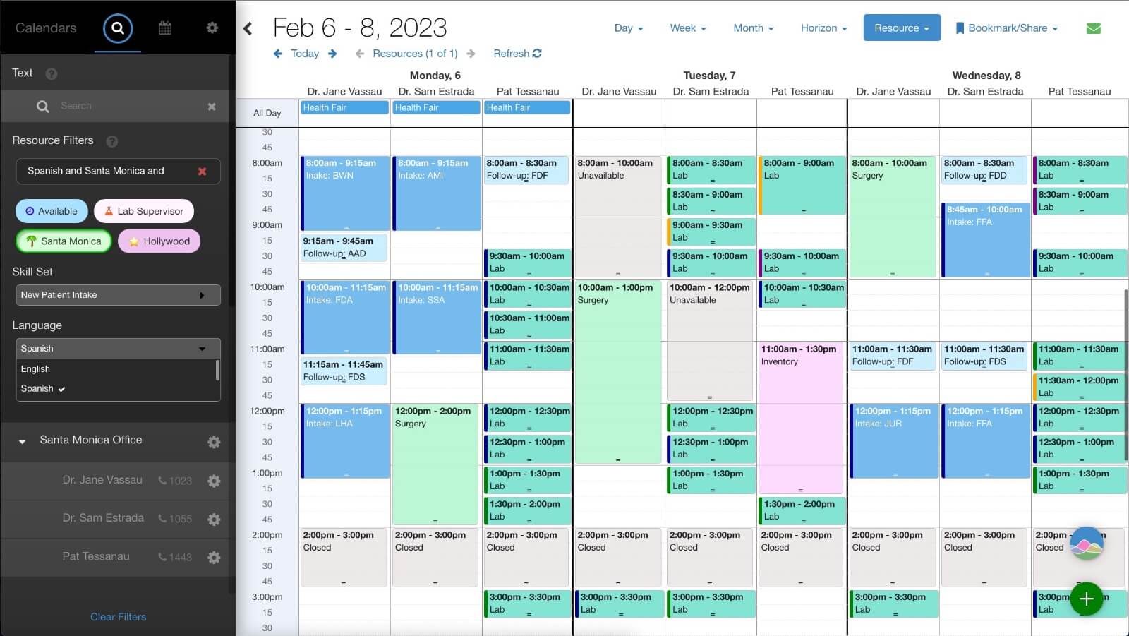
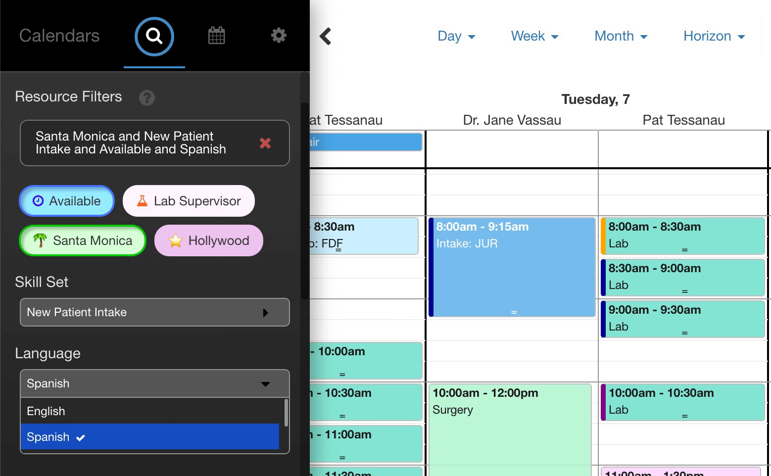
In the example video, we’ve set up two medical clinics. If a patient calls wanting to schedule some lab work at a specific clinic, you can quickly switch to see who’s available at the location. You can then use the skills dropdowns to find employees who can perform a blood draw, and who also speak Spanish. This quickly narrows down the available slots while you’re still on the phone.
Download & Installation
Please download the example code here. Before installing the app actions, you must define a list of tags for your resources using the gear icon for each resource in your resource list, as shown here. Alternatively, you can pull in resource tags from FileMaker or Salesforce.
Configuration
The following configuration changes will need to be made in your app action before you install it in DayBack:
inputs.resourceFiltersOnTop = true;
- If set the true, this setting will move the status filters below your resource filters in the sidebar. Whether you prefer your status filters above or below your resource list largely depends on the workflow you use most frequently.
inputs.noMatchFadesCalendar = true;
- If set to true, this setting will fade the calendar to grayscale if your tag filters result in no match.
Configuring Tag Buttons
To create tag buttons, you must add each tag to the inputs.tagFilters object and then configure several variables for each button:
class (optional):
- An optional class ID for this tag if you wish to apply custom styles beyond a tag color, icon, icon color, and border color
color:
- The color code of the background color for the tag. If no color is specified, the default gray tag color will be used.
icon:
- This is either a FontAwesome icon name such as fa-pencil, fa-clock-o, etc., or it is a URL of an image file that should be used as an icon. Omitting an icon will just show a text tag.
iconColor:
- This only applies to FontAwesome icons, and can be omitted if using an image for an icon.
borderColor:
- This is the border color of the tag when the tag is toggled on.
Example:
Here is an example configuration section for a list of tag buttons:
inputs.tagFilters = {
        Available: {
            class: "test",
            color: "rgb(168, 224, 255)",
            icon: "fa-clock-o",
            iconColor: "rgb(52, 0, 244)",
            borderColor: "rgba(0, 0, 155, 0.5)"
        },
        "Lab Supervisor": {
            class: "person",
            color: "#FFF4FF",
            icon: "fa-flask",
            iconColor: "#FF5F1F",
            borderColor: "rgba(255, 95, 31, 0.8)"
        },
        "Santa Monica": {
            class: "any",
            color: "#DDFFDD",
            icon: "https://a.slack-edge.com/production-standard-emoji-assets/14.0/apple-medium/1f334@2x.png",
            borderColor: "rgba(0,155,0,0.8)"
        },
        Hollywood: {
            class: "any",
            color: "rgb(237, 194, 238)",
            icon: "https://a.slack-edge.com/production-standard-emoji-assets/14.0/apple-medium/2b50@2x.png",
            borderColor: "rgba(100,0,100,0.5)"
        }
    };
Configuring Multi-Select Tag Groups
You may define a group of related tags by specifying a group followed by an object which defines the list of related tags for that group. The basic structure for the object is as follows:
inputs.tagGroups = {
            timezone: {},
               skill: {},
            language: {},
     };
Each tag group contains three parameters:
groupname:
- The description of the select box that will appear in white font above the select box itself.
boxtitle:
- The instruction to the user describing the contents of the select box.
tags:
- An object containing tag codes and the full-text description of what the tag means. Having a tag code and a full-text description allows you to explain the tags you’ve defined for each resource with a more rich text description.
Example:
This example defines a select box of time zones. You would need to specify the tags: EST, CST, PST, NZST to make use of this feature.
inputs.tagGroups = {
         timezone: {
             groupname: "Time Zone",
             boxtitle: "Select Time Zone",
             tags: {
                 EST: {
                     name: "East Coast",
                 },
                 CST: {
                     name: "Central",
                 },
                 PST: {
                     name: "Pacific",
                 },
                 NZST: {
                     name: "New Zealand",
                 }
             }
         },
     };
Summary
This app action is available for you to download and customize. If you’d like help customizing this to work for your specific workflow, please get in touch. We’d love to help.
Leave a Reply