Color-Coding by a Second Field
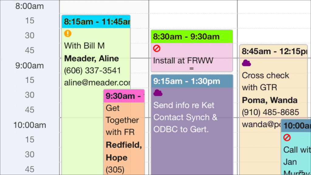
Here’s a beautiful example of adding additional color-coding options and icons to DayBack Calendar. This customer wanted to retain DayBack’s default color-coding for status but add another color–shown here as the header of the event–for color-coding by resource (salesperson, in this case). They also wanted some icons to highlight a few facts about the event. Icons show if the event can be moved or if there is bad weather present.
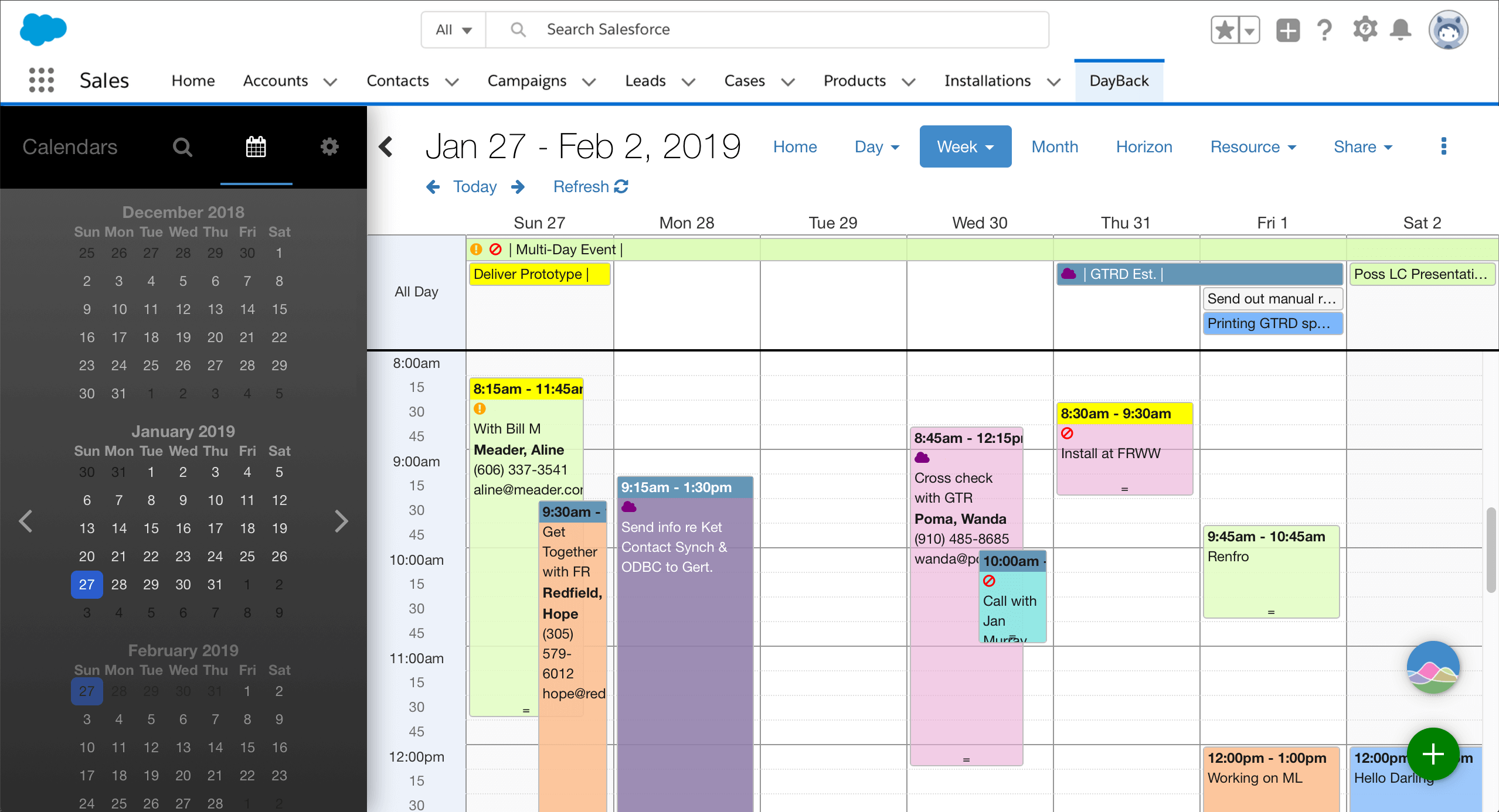
Note that if you don’t need a second color, and just want to color-code by resource, you’ll find instructions for doing that here. And while this example adds a second color according to resource, you can base this color on any field in your Salesforce object: just replace Owner.Name below with your field name, remembering to use Name__c if it’s a custom field.
Add A Second Color to Your Calendar
Since you have complete control over DayBack’s CSS, adding these colored headers and icons is pretty easy. For an introduction to editing DayBack’s CSS, look here: customizing the calendar’s appearance. And you’ll find step-by-step instructions for adding icons here: adding styles and colored icons. Like those examples, the implementation above adds some CSS classes to your object’s title field. It then styles those classes by adding some new CSS to the DayBack.
In DayBack’s field mapping, change your “Display” field to something like this:
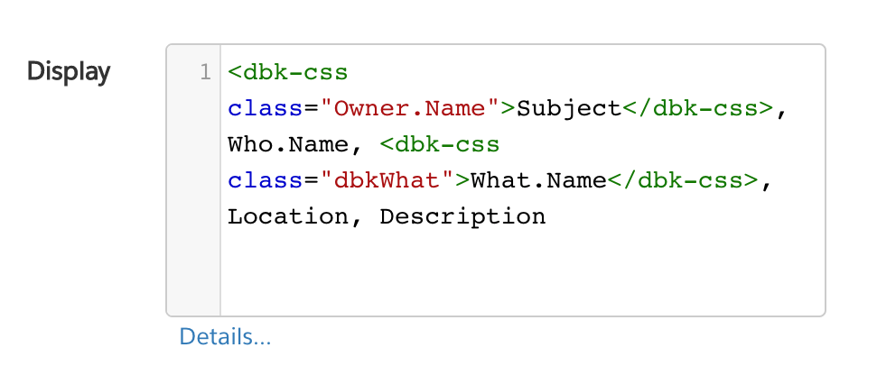
It’s wrapping the Subject in the dbk-css with a class of “Owner.Name” that will let us add a specific CSS color for each owner.
FileMaker
For FileMaker, your display calc is in the DBk_EventSummaryCalc field of the event table, so this customization would look more like this:

Defining styles
Now, add the following to DayBack’s CSS where “.Beth.Reynolds” is a resource (salesperson) named “Beth Reynolds”:
/* Resource Color Bar Customizations */

.Beth.Reynolds::before, .James.Woolsey::before, .Peter.Samuels::before {
   position: absolute;
   left: 0;
   top: 0;
   content: ' ';
   width: 100%;
   height: 1.5em;
   z-index: -1;
}
.fc-view-basicHorizon .Beth.Reynolds::before, .fc-view-basicHorizon .James.Woolsey::before, .fc-view-basicHorizon .Peter.Samuels::before {
   position: absolute;
   left: 0;
   top: 0;
   content: ' ';
   width: 100%;
   height: 2em;
   z-index: -1;
}

.fc-event-inner .Beth.Reynolds::before {
 	background-color: teal;
}
.fc-event-inner .James.Woolsey::before {
 	background-color: orange;
}
.fc-event-inner .Peter.Samuels::before {
	 background-color: red;
}

/* End Resource Color Bar Customizations */
Here you’re hard coding each of your resource names into DayBack’s CSS and that works fine if you don’t bring on new resources very often.
Adding Icons
If you’d like to add a single icon, such as a caution icon when an event has the status of “errors”, you’ll find instructions for that here: adding styles and colored icons.
To add the icons we’re using above, you’ll want to add three custom fields that we’re using for these “flags”.
- DBk_FlagWeather__c (contains “Weather” when true)
- DBk_FlagUrgent__c (contains “Urgent” when true)
- DBk_FlagDoNotMove__c (contains “DoNotMove” when true)
These work well as additional fields in DayBack formatted as Radio buttons without titles. Then add the following to the front of your “Title” field in DayBack’s field mapping:
<dbk-css title="DBk_FlagWeather__c" class="DBk_FlagWeather__c"></dbk-css>,<dbk-css title="DBk_FlagUrgent__c" class="DBk_FlagUrgent__c"></dbk-css>,<dbk-css title="DBk_FlagDoNotMove__c" class="DBk_FlagDoNotMove__c"></dbk-css>,
Finally, add this CSS to create colored icons for each flag field that has a value:
/* Flag Icon Customizations */

.Weather::before {
   font-family: FontAwesome;
   content: "\f0c2";
   padding-right: 3px;
   color: purple;
}

.Urgent::before {
   font-family: FontAwesome;
   content: "\f06a";
   padding-right: 3px;
   color: orange;
}

.DoNotMove::before {
   font-family: FontAwesome;
   content: "\f05e";
   padding-right: 3px;
   color: red;
}

/* End Flag Icon Customizations */
That’s it! And remember, if you need help customizing this CSS or adding additional colors, please get in touch. We’re here to help.
Leave a Reply