Show Charts, Tables, Maps, and Images when Hovering Over an Event
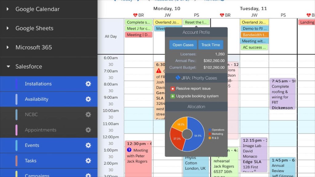
We love introducing powerful new ways to drive your decision-making in DayBack. Our latest app action lets you create advanced tooltips, potent data visualizations, and take action from buttons in your tooltips.
You can take advantage of your Salesforce or FileMaker data by loading it dynamically when a user hovers over an event. Additionally, you can integrate DayBack with Google’s Charting API and display charts and graphs using advanced chart types. Your tooltips can interact with 3rd party APIs, such as JIRA tickets and case tracking software. You can also add buttons that start new workflows, open 3rd party apps, or start Zoom meetings.
This single app action also lets you define multiple tooltip styles in one app action. Tooltips can be configured to display different data based on the logged-in user, event status, or appointment type.
Some Tooltip Examples
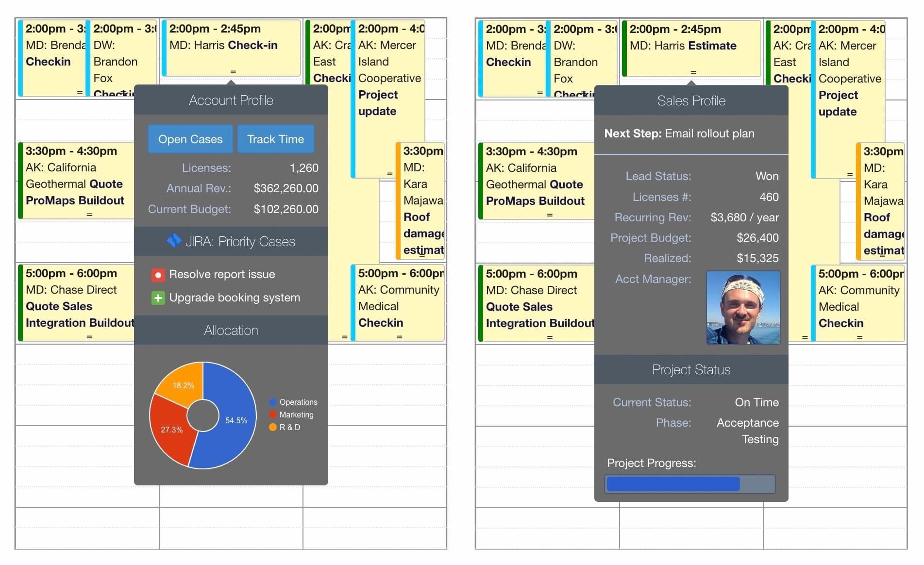
3rd Party Integrations & Google Charts
- Add buttons to run common tasks: open records in FileMaker, Salesforce, or open 3rd party apps.
- Pull information from your case management system such as JIRA, or another 3rd party API
- Visualize your data using Charts and Graphs using Google Charts API. Check out the gallery of Chart types that you can draw using the free Google Charts API.
- Pull in complex data from Salesforce or from FileMaker using custom queries across multiple objects.
- Render images or plot a progress bar to get a quick visual sense of how your project is performing.
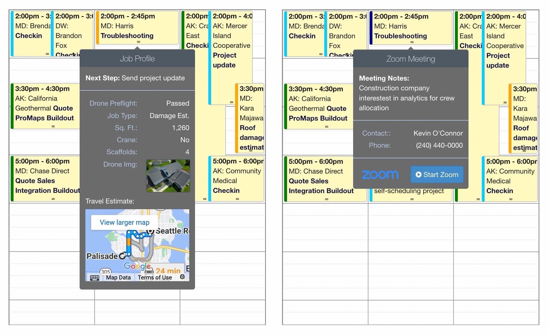
Google Maps, Zoom, and Custom Images
- Start a scheduled Zoom call directly from a tooltip.
- Load images from your database or 3rd party hosting providers.
- Calculate drive time or traffic delays between your home location and your next appointment.
The possibilities for what you can do with tooltips are endless. If you have questions about how to leverage advanced tooltips in your DayBack integration, or would like us to help integrate tooltips for you, please get in touch. We’d love to help.
Installation & Configuration
The app action code is available for you to download and customize. Download our example directly from DayBack’s extensions library here: Advanced Tooltips. The rest of this post will illustrate the options available for customizing your tooltips inside this custom action.
Supported Row Types
- Headers
- Headers let you add a title to your tooltip or group related information together
- Label and Value Rows
- Display field descriptions together with field values in structured columns
- Freeform Text Rows
- Display text data, images, maps, or graphs into text rows by adding custom functions that return plain text or HTML
- Separator Row
- Add a horizontal line that groups related information
- Progress Bar
- Display a progress bar for any data value that you’d like to visualize
Define Multiple Tooltip Types
You may have multiple tooltip cards and set a restriction that will show the card only for a given user or if certain information about the event is true.
The app action will scan the tooltips you’ve defined in the order in which you have defined them. It will display the first applicable tooltip permitted by the restriction rules you have defined.
A Simple Example
This very basic tooltip has no restriction rules and shows the current status of an event when the mouse hovers over the event. Since no restriction rule has been specified, the tooltip will display for all events in the source where this On Event Hover action has been installed.
inputs.tooltips.default = {
    content: "Status: " + event["status"]
};
Required Fields:
- content – a free-form value containing plain text/html
- Text will be displayed in DayBack’s default style. If you’d like formatted rows, specify a rows parameters instead.
– or –
- rows – An array of row definitions (see row types below).
Option Fields:
- className – Optional – You can have multiple tooltip styles
- You can have multiple tooltip styles. If you do not specify a style, this app action will use the style customToolTip.
- restriction – Optional – javascript function that returns a true if the event is in a given status.
- By default, a tooltip will display for all events and users in a given source, but you can call a custom function as in the example below, which shows the tooltip only if the event is in Pending status. See restrictTooltipToStatus() function for how to construct restriction checks. For example:
restriction: function() {
   return restrictTooltipToStatus('Pending');
}- tooltipOptions – Optional – an object containing configuration parameters for the dbk.tooltip() function.
- By default, the tooltip will show after 350 ms has elapsed. To change this, you can specify a custom delay for the tooltip function. See the following link for more options: https://docs.dayback.com/article/141-tooltips
// Delay tooltip display by 1 second
tooltipOptions: { delay: 1000; }
Row Types and Parameters:
- header – Displays a tooltip header or title.
- text: Text of the tooltip.
- class: optional class to apply a custom style.
- labelValue – Displays two columns with right-aligned labels and left-aligned values. Accepts an optional 3rd parameter to define a custom style. The built-in custom style ‘textRight’ can be used to align values to the right. This is useful when displaying numbers or currency.
- label: The text of the label.
- value: The text of the value, formatted as you would like it. For numbers and currency, you can use the built in formatCurrency() function takes an optional currency sign and a number:
- formatCurrency(‘$’, ‘1234.00’) // Returns $1,234.00
- formatCurrency(”, ‘1234.00’) // Returns 1,234.00
- class: optional class to apply a custom style to the value columns
- rowClass: Optional class that determines if rows should display or bottom
- labelSize: Specify a number 1-12 for column size. By default, both label and value are 6 columns each.
- valueSize: Specify a number 1-12 for column size. By default, both label and value are 6 columns each.
- textRow – Displays a full-width row:
- text: The text can be anything, including custom HTML that displays objects like maps and charts.
- class: optional class to apply a custom style.
- progressBar – Displays a progress bar indicating. Accepts three parameters:
- title: Text title of the data being reported.
- scale: Maximum value that defines when the item is 100% complete.
- value: Current progress on a scale of 0 to ‘scale’
- separator – Shows a horizontal line between rows.
- class: optional class to apply a custom style.
Referencing Custom Fields in Your Tooltip:
It’s common to display custom fields that you have mapped in your data source. To reference a custom field by name rather than a numerical ID, you can call the getCustomFieldValue() function. Here’s an example of showing a Label Value row for a custom field with Store in Field Name of “billingStatus”:
rows: {
    labelValue: {
        label: 'Billing Status',
        value:  getCustomFieldValue('billingStatus')
    }
}
Special CSS Classes:
You can add one or more of the following classes by separating them with a space to the class parameter for any row.
- textRight – Will align the cell contents to the right.
- showTooltipRowOnBottom – Will show the row only if the tooltip is displaying above the event popover.
- showTooltipRowOnTop – Will show the row if the tooltip is displaying below the event popover.
Buttons and Charts:
We provide sample code for making a Pie Chart using Google Docs as well as adding clickable buttons. The buttons are combined with the showTooltipRowOnBottom and shoTooltipRowOnTop CSS classes, which allow you to move the buttons closer to the mouse depending on where the tooltip is displayed. To call a custom function and display the result, use a standard textRow definition and set the text to the return value of the function:
textRow: {
    text:   makePieChart(),
    class:  'myPieChartClass'
}

textRow: {
    text:   makeCustomButtons(),
    class:  'myPieChartClass'
}
If you are planning on using the Google Charts API to create custom data visualizations in your tooltips, you must first pre-load the Google Charts API javascript library by adding the following code to your Before Calendar Rendered app action:
var script = document.createElement('script');
script.setAttribute('src','https://www.gstatic.com/charts/loader.js');
document.head.appendChild(script);
Then you can use the code below to get started with charts and buttons. The makeCustomButtons() function below creates two buttons. The makePieChart() function returns a Google Chart.
    function makeCustomButtons() {
        // Example function of how to make buttons for opening external links
        return '<center> \
        <button class="btn btn-sm btn-primary dbk_button_primary" onClick="window.open(\'https://...');">Open Cases</button> \
        <button class="btn btn-sm btn-secondary dbk_button_primary" onClick="window.open(\'https://...');">Track Time</button> \
        </center>';
    }

    function makePieChart() {
        // If you are planning on using the Google Charts API to create
        // custom data visualizations in your tooltips, you must first
        // pre-load the Google Charts API javascript library by adding the
        // following code to your Before Calendar Rendered app action:
        //     var script = document.createElement('script');
        //     script.setAttribute('src','https://www.gstatic.com/charts/loader.js');
        //     document.head.appendChild(script);

        return '<script type="text/javascript"> \
        google.charts.load("current", {"packages":["corechart"]}); \
        google.charts.setOnLoadCallback(drawChart); \
        function drawChart() { \
            var data = google.visualization.arrayToDataTable([ \
            ["Task", "Hours per Day"], \
            ["Operations",  60], \
            ["Marketing",  30], \
            ["R & D",  20], \
            ]); \
            var options = { \
                pieHole: 0.3, \
                pieSliceTextStyle: { color: "white" }, \
                chartArea: {left:0,top:0,width:"100%",height:"100%"}, \
                legend: {position: "right", alignment: "center", textStyle: {color: "white", fontSize: 8} }, \
                backgroundColor: "transparent", width: "100%", height: "125px", color: "white" \
            }; \
            var chart = new google.visualization.PieChart(document.getElementById("chart")); \
            chart.draw(data, options); \
        } \
        </script> \
        <div id="chart" style="width: 100%; height: 125px; padding: 0px; padding-left: 5px; margin: 0px;"></div>';
    }
Complete Example
Here’s how to define an advanced tooltip that only appears for events that have a reminder type set to “Check-in”. It then calls a custom function to return HTML that loads a tooltip.
Please don’t hesitate to get in touch if you have questions. And happy tooltips!
inputs.tooltips.checkin = {
className: "customToolTip",
restriction: function () {
// Check that Custom field Reminder Type is set to "Check-in"
const reminderType = getCustomFieldValue("reminderType");
return Array.isArray(reminderType) &&
reminderType.includes("Check-in")
? true
: false;
},
tooltipOptions: { delay: 350 },
rows: [
{
type: "header",
text: "Account Profile"
},
{
type: "textRow",
text: makeCustomButtons(),
class: "showTooltipRowOnBottom"
},
{
type: "labelValue",
label: "Licenses",
value: formatCurrency("", "1260"),
class: "textRight"
},
{
type: "labelValue",
label: "Annual Rev.",
value: formatCurrency("$", "362260", 2),
class: "textRight"
},
{
type: "labelValue",
label: "Current Budget",
value: formatCurrency("$", "102260", 2),
class: "textRight"
},
{
type: "header",
text: '<img src="https://seeklogo.com/images/J/jira-logo-C71F8C0324-seeklogo.com.png" style="margin-top: -5px; height: 15px; width: 15px; text-align:middle; vertical-align:middle"> JIRA: Priority Cases '
},
{
type: "textRow",
text: ' <img src="https://seedcode.atlassian.net/rest/api/2/universal_avatar/view/type/issuetype/avatar/10303?size=medium"> Resolve report issue'
},
{
type: "textRow",
text: ' <img src="https://seedcode.atlassian.net/rest/api/2/universal_avatar/view/type/issuetype/avatar/10311?size=medium"> Upgrade booking system'
},
{
type: "header",
text: "Allocation"
},
{
type: "textRow",
text: makePieChart()
},
{
type: "textRow",
text: makeCustomButtons(),
class: "showTooltipRowOnTop"
}
]
};

Leave a Reply