In our previous article, we looked at creating custom dialogs for DayBack with multiple button options. This article will expand on this pattern and add different input types to these dialogs to create simple forms. With forms, DayBack’s Event Actions can present users with a rich set of controls for gathering data and support more varied workflows.
Here’s a preview of one of the dialogs we’ll create in this post:
Rethinking the Send Notifications Example
In our example from the first post, sending an email required a dialog with 4 possible choices when an appointment was rescheduled. The choices were presented as four buttons. This works well, but since buttons end the dialog experience for the user, it’s not difficult for the user to click the wrong button without a chance to review their choice before moving on. This is the advantage of having just one or two buttons on the dialog with simple and explicit choices like OK or Cancel. The details about who gets the notification could instead be handled with input fields–and that input can be reviewed and changed before deciding to submit the form with a button.
Here’s a new version of the dialog where checkboxes now handle the decision about who receives the notifications.

Using ng-model for Form Inputs
Similar to the Angular directive ng-click we looked at in the previous post, DayBack can use the directive ng-model to bind an input element to data retrieved from our Custom Action when the dialog is closed. In this case, our input elements are checkboxes.
<input type="checkbox" ng-model="popover.config.owner">
As in our previous example, the popover.config object is passed into the dialog’s scope from the Custom Action, and then the values bound to the checkboxes are examined in the callback function that’s triggered when a button is clicked.
Here’s the example code for this entire action. These actions are writing the results of the dialog to a custom field in the appointment, so be sure to specify the Id of your custom field on line 17 when using this code.
//Set Notification Field v2.0

//Purpose:
//This action will present a modal dialog when an existing Event has its start or end modified
//Dialog will have 1 button and 2 checkboxes for indicating who (if anyone) should receive a notification
//Custom Field will be set based on user selection

//Action Type: On Event Save
//Prevent Default Action: Yes

//More info on custom actions here:
//https://docs.dayback.com/article/20-event-actions

//config variable
// !!UPDATE THIS VALUE TO THE ID OF YOUR CUSTOM FIELD!!
//https://docs.dayback.com/article/109-additional-fields
var messagingFieldId = '1618332924711-9890348236';


//----------- You shouldn't need to edit below this line -------------------


//trigger action function?
if( event.eventID && ( changesObject.start || changesObject.end )){
  //existing appointment (has an Id) has had its start or end changed
  appointmentMoved();
}
else{
  //new appointment or no change to start or end
  action.callbacks.confirm();
}

function appointmentMoved() {
  //config variables
  var title = 'Appointment Rescheduled';
  var message = 'Do you need to email the Owner and/or Contractor of the change to this appointment?';

  //define the button's html
  //use angular ng-click to bind functions passed in config below
  //Send buttons, class as success buttons
  var okButton = '<button ng-click="popover.config.buttonCallbackFunction();" class="btn btn-xs btn-success dbk_button_success">OK</button>';

  //define popover html as string, inserting title, message and buttons
  var template =
    '<div style="background: rgba(0,0,0,0.75); color: white;">' +
    '<div class="pad-large text-center">' +
    '<h4 translate>' + title + '</h4>' +
    '<p>' + message + '</p>' +

    //checkbox for owner
    '<div style="margin-bottom:8px;text-align:left;margin-left:120px;" class="checkbox">' +
    '<label style="padding-left:10px">' +
    '<input type="checkbox" ng-model="popover.config.owner">' +
    '<span>Email Owner</span>' +
    '</label>' +
    '</div>' +

    //checkbox for contractor
    '<div style="margin-bottom:8px;text-align:left;margin-left:120px;" class="checkbox">' +
    '<label style="padding-left:10px">' +
    '<input type="checkbox" ng-model="popover.config.contractor">' +
    '<span>Email Contractor</span>' +
    '</label>' +
    '</div>' +
    //end checkboxes

    '<div class="pad">' + okButton +
    '</div>' +
    '</div>' +
    '</div>';

  //define popover config
  //define button functions and width, the rest can stay unchanged
  var config = {
    container: document.querySelector('#calendar-container') ? '#calendar-container' : '#app-container',
    type: 'modal', // modal or popover
    destroy: true,
    buttonCallbackFunction: buttonCallback,
    width: 400,
    onShow: '',
    onShown: '',
    onHide: '',
    onHidden: '',
    show: true
  };

  //call utility function to evoke modal
  utilities.popover(config, template);

  //button callback function
  function buttonCallback() {
    //close popover
    config.show = false;
    //examine checkbox entries and add results to array
    var result = [];
    if(config.owner){
      result.push('Owner');
    }
    if(config.contractor){
      result.push('Contractor');
    }
    //join result array into string, add to custom field, and report
    changesObject[messagingFieldId] = result.join(';');
    //allow on save event to complete
    action.callbacks.confirm();
  }
}
Using Drop-Down Fields in Calendar Forms
ng-model can also be bound to a Select element so the dialog will include a drop-down for selecting from multiple values. In this next example, users will be presented with a dialog box for choosing who initiated the rescheduling of the appointment with the selection written back to the appointment’s record.
Adding Conditional Formatting with ng-class
In this new example, validation has also been added to the OK button, so the user can only complete the dialog when they’ve chosen a value from the drop-down. To add a visual indicator of this requirement, the OK button can be styled using ng-class, so it’s greyed out until the select element has been populated.

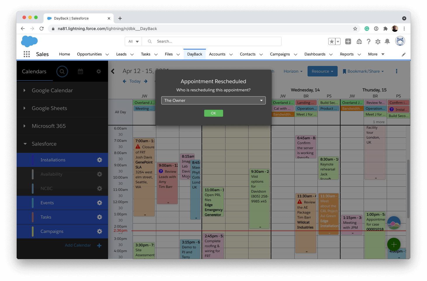
You can apply the class to an element with the following syntax. The class name is specified first, followed by a colon, and then the boolean condition in JavaScript specifying when the class should be added to the element. If there are multiple conditions and classes, they are separated by a comma, so here we see that when the scope variable popover.config.party is empty, the class btn-grey is applied. When popover.config.party is populated, the class btn-success is applied.
ng-class="{'btn-grey' : !popover.config.party, 'btn-success' : popover.config.party}"btn-success is a stock class in DayBack, and we can define the new class btn-grey in DayBack’s custom CSS section like this.
.btn-grey {
  background-color:grey;
  border-color:grey;
  color:black;
}
Here’s the full example code for this action. Here you’ll want to make sure you specify the custom field’s id you’re using on line 18.
//Who Rescheduled Appointment v1.0

//Purpose:
//This action will present a modal dialog when an existing Event has its start or end modified
//Dialog will have a drop-down where the user can select the Owner or the Contractor as the one who rescheduled
//The value is required so the OK button will be disabled and greyed out until a choice is made and then it will turn green
//Custom Field will be set based on user selection

//Action Type: On Event Save
//Prevent Default Action: Yes

//More info on custom actions here:
//https://docs.dayback.com/article/20-event-actions

//config variable
// !!UPDATE THIS VALUE TO THE ID OF YOUR CUSTOM FIELD!!
//https://docs.dayback.com/article/109-additional-fields
var rescheduledByFieldId = '1618332924711-9890348236';


//----------- You shouldn't need to edit below this line -------------------


//trigger action function?
if( event.eventID && ( changesObject.start || changesObject.end )){
  //existing appointment (has an Id) has had its start or end changed
  appointmentMoved();
}
else{
  //new appointment or no change to start or end
  action.callbacks.confirm();
}

function appointmentMoved() {
  //config variables
  var title = 'Appointment Rescheduled';
  var message = 'Who is rescheduling this appointment?';

  //define the button's html
  //use angular ng-click to bind functions passed in config below
  //use ng-class to apply classes based on whether a selection has been made in the drop-down
  var okButton = '<button ng-class="{\'btn-grey\':!popover.config.party, \'btn-success\':popover.config.party}" ng-click="popover.config.buttonCallbackFunction();" class="btn btn-xs">OK</button>';

  //define popver html as string, inserting title, message and buttons
  var template =
    '<div style="background: rgba(0,0,0,0.75); color: white;">' +
    '<div class="pad-large text-center">' +
    '<h4 translate>' + title + '</h4>' +
    '<p>' + message + '</p>' +

    //define drop-down (select) with options and bind to popover.config.party using angular ng-model
    '<div class="select-wrapper" style="margin:12px 0 8px 0">' +
    '<select ng-model="popover.config.party" style="color:white;position:relative;">' +
    '<option value="owner">The Owner</option>' +
    '<option value="contractor">The Contractor</option>' +
    '</select>' +
    '</div>' +
    //end drop-down/select

    '<div class="pad">' + okButton +
    '</div>' +
    '</div>' +
    '</div>';

  //define popover config
  //define button functions and width, the rest can stay unchanged
  var config = {
    container: document.querySelector('#calendar-container') ? '#calendar-container' : '#app-container',
    type: 'modal', // modal or popover
    destroy: true,
    buttonCallbackFunction: buttonCallback,
    width: 400,
    onShow: '',
    onShown: '',
    onHide: '',
    onHidden: '',
    show: true
  };

  //call utility function to evoke modal
  utilities.popover(config, template);

  //button callback functions
  function buttonCallback() {

    //only continue if a selection has been made in the drop-down
    if(config.party){
      //hide the popover
      config.show = false;
      //set custom field based on the selection
      changesObject[rescheduledByFieldId] = config.party;
      //allow on save event to continue
      action.callbacks.confirm();
    }

  }
}
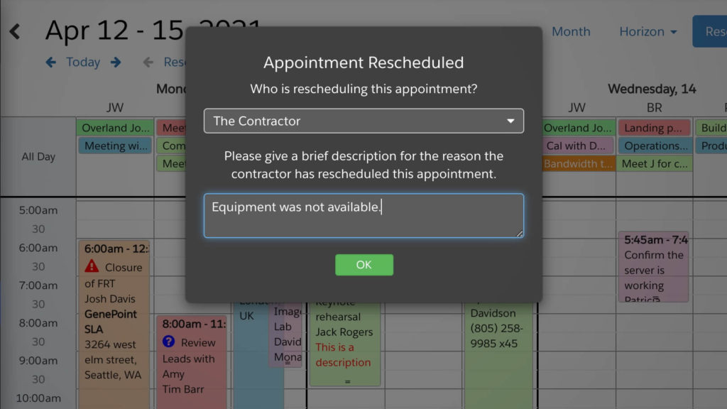
Conditionally Showing a Text Input with ng-show
Let’s expand on this example a little more and add the requirement that if the contractor is the one who rescheduled the appointment, we must record a reason as well.
We’ll use ng-show to display additional text in the dialog where the user can enter why the appointment was rescheduled. If the owner is the one who rescheduled the appointment, then a reason won’t be required, so the text input for this will remain hidden. Then ng-show syntax is just a boolean expression that indicates whether the element should be displayed or not.
ng-show="popover.config.party==='contractor'"
The ng-class for our button now needs to check if the reason has been given if a contractor is chosen, so it’s a little more complex.
ng-class="{'btn-grey':!popover.config.party || popover.config.party==='contractor' && !popover.config.reason, 'btn-success':popover.config.party==='owner\ || popover.config.party===\contractor' && popover.config.reason }"When a contractor is selected, the dialog expands and includes the text area.
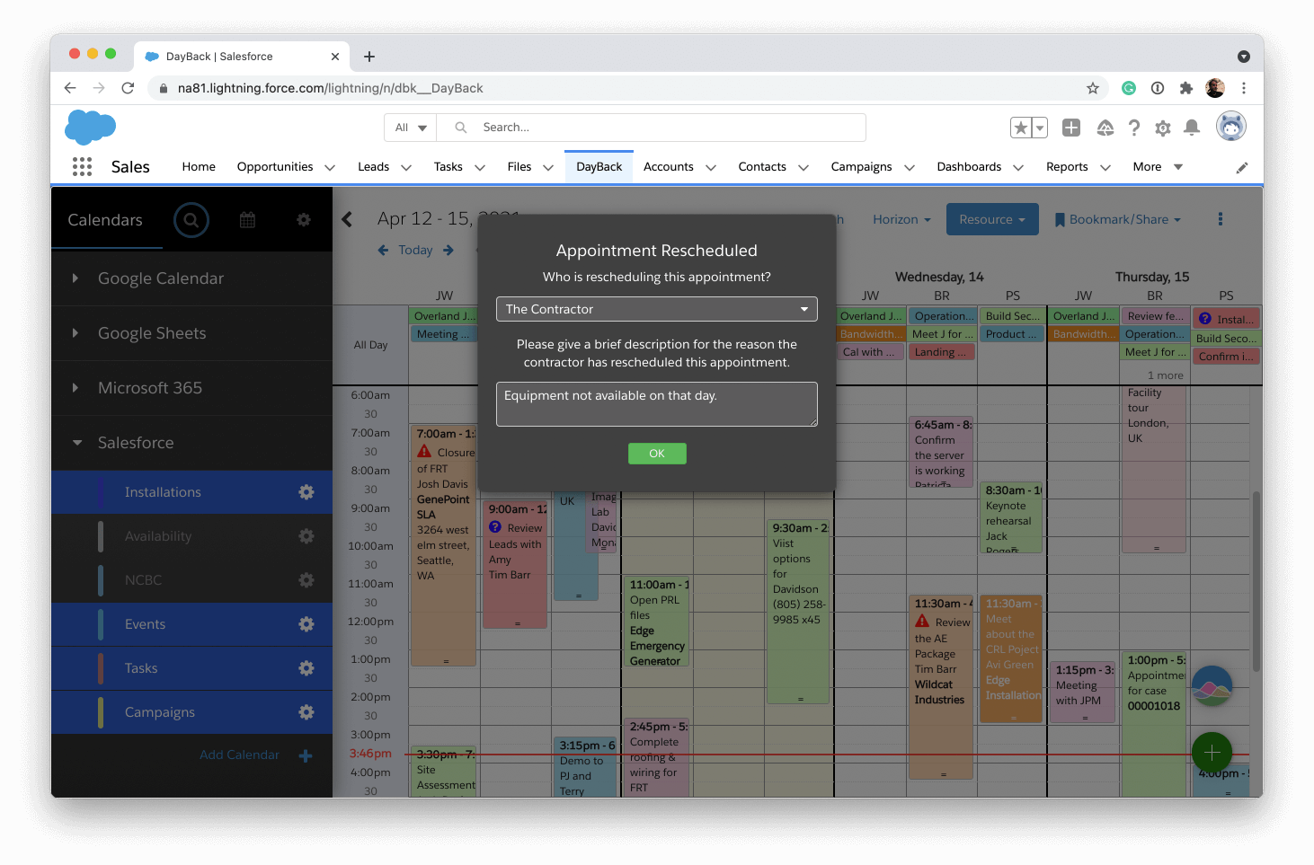
Here’s the full example code for this action. Here you’ll want to make sure you specify the custom field’s id you’re using on line 19.
//Who Rescheduled Appointment v2.0

//Purpose:
//This action will present a modal dialog when an existing Event has its start or end modified
//Dialog will have a drop-down where the user can select the Owner or the Contractor as the one who rescheduled
//The value is required so the OK button will be disabled and greyed out until a choice is made and then it will turn green
//If contractor is selected, then a text field will be displayed so a reason can be entered. Reason is required if contractor is selected
//Custom Field will be set based on user selection

//Action Type: On Event Save
//Prevent Default Action: Yes

//More info on custom actions here:
//https://docs.dayback.com/article/20-event-actions

//config variable
// !!UPDATE THIS VALUE TO THE ID OF YOUR CUSTOM FIELD!!
//https://docs.dayback.com/article/109-additional-fields
var rescheduledByFieldId = '1618332924711-9890348236';


//----------- You shouldn't need to edit below this line -------------------


//trigger action function?
if( event.eventID && ( changesObject.start || changesObject.end )){
  //existing appointment (has an Id) has had its start or end changed
  appointmentMoved();
}
else{
  //new appointment or no change to start or end
  action.callbacks.confirm();
}

function appointmentMoved() {
  //config variables
  var title = 'Appointment Rescheduled';
  var message = 'Who is rescheduling this appointment?';

  //define the button's html
  //use angular ng-click to bind functions passed in config below
  //use ng-class to apply classes based on whether a selection has been made in the drop-down
  //if owner is selected, button is enabled. If contractor is selected then a reason also must be given to enable the button
  var okButton = '<button ng-class="{\'btn-grey\':!popover.config.party || popover.config.party===\'contractor\' && !popover.config.reason, \'btn-success\':popover.config.party===\'owner\' || popover.config.party===\'contractor\' && popover.config.reason }" ng-click="popover.config.buttonCallbackFunction();" class="btn btn-xs">OK</button>';

  //define popver html as string, inserting title, message and buttons
  var template =
    '<div style="background: rgba(0,0,0,0.75); color: white;">' +
    '<div class="pad-large text-center">' +
    '<h4 translate>' + title + '</h4>' +
    '<p>' + message + '</p>' +

    //define drop-down (select) with options and bind to popover.config.party using angular ng-model
    '<div class="select-wrapper" style="margin:12px 0 8px 0">' +
    '<select ng-model="popover.config.party" style="color:white;position:relative;">' +
    '<option value="owner">The Owner</option>' +
    '<option value="contractor">The Contractor</option>' +
    '</select>' +
    '</div>' +
    //end drop-down/select

    //define text area and use angular ng-show to display it if contractor is selected.
    '<div ng-show="popover.config.party===\'contractor\'" class="form-group" style="margin:15px 0 8px 0;">' +
    'Please give a brief description for the reason the contractor has rescheduled this appointment.' +
    '<textarea ng-model="popover.config.reason" placeholder="Reason" rows="2" cols="46" class="form-control" style="margin-top:12px;background-color:rgba(255,255,255,.15);color:white"></textarea>' +
    '</div>' +
    //end text area

    '<div class="pad">' + okButton +
    '</div>' +
    '</div>' +
    '</div>';

  //define popover config
  //define button functions and width, the rest can stay unchanged
  var config = {
    container: document.querySelector('#calendar-container') ? '#calendar-container' : '#app-container',
    type: 'modal', // modal or popover
    destroy: true,
    buttonCallbackFunction: buttonCallback,
    width: 400,
    onShow: '',
    onShown: '',
    onHide: '',
    onHidden: '',
    show: true
  };

  //call utility function to evoke modal
  utilities.popover(config, template);

  //button callback functions
  function buttonCallback() {

    //only continue if we've selected the owner or if contractor is selected we also have a reason
    if(config.party==='owner' || config.party==='contractor' && config.reason){
      //hide the popover
      config.show = false;
      //set custom field based on the selection
      changesObject[rescheduledByFieldId] = config.party;
      //add reason of we have one
      if(config.reason){
        changesObject[rescheduledByFieldId] += ':' + config.reason;
      }
      //allow on save event to continue
      action.callbacks.confirm();
    }

  }
}
Conclusions
In addition to adding buttons to handle different options, DayBack also provides the ability to create forms with inputs to capture more specific information from a dialog while still providing a simple and intuitive experience for the user. Using a few simple Angular directives can unlock these options in our templates and developers can create an experience that precisely fits their workflow’s needs.
For another example of how far you can take these forms, check out how we’re automating reminders from our help desk system.
Just wanted to say thanks again. The possibilities that this opens up are amazing. Between this and being able to create a Salesforce record from inside Dayback… it’s borderline life changing. At minimum, it’s letting me shortcut some otherwise complicated processes.
Wow, Thanks, Blake!