Chart Your Schedule
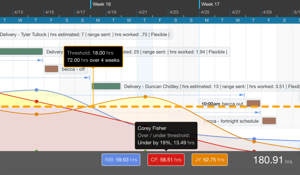
You’ll find a couple of new tooltips in DayBack’s charts and analytics. These should help you make better sense of your targets over long timescales and see how close you are to meeting them. The new tooltips are doing some date math for you.
Here’s how they work:
If you’re new to charting your schedule, check out the Introduction to Calendar Analytics which includes short videos for a few different use cases around field service, blocking off time, and balancing your workload.
Swimlanes
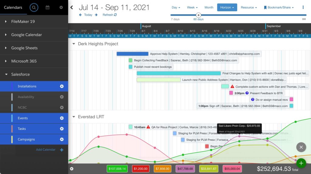
In the video above, DayBack is also breaking out your schedule by resource/employee. You can create swimlanes and charts like this from any field. Learn more here: Swimlanes from Any Field in Your Calendar.

Leave a Reply