Take Action from Within Your Calendar
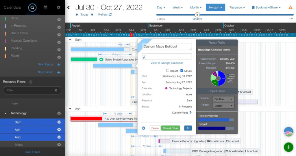
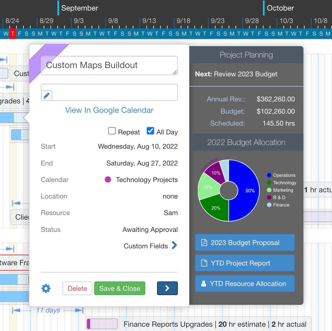
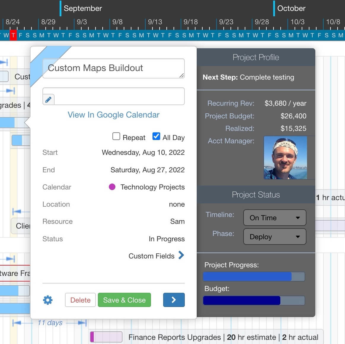
We’d love to show you a powerful new DayBack extension that lets you embed custom workflows, data entry forms, and data visualizations in your calendar with custom side panels (sometimes called “drawers”).
Like our Advanced Tooltips, custom side panels can load additional information from your Salesforce or FileMaker tables, revealing more of the information you need for decision-making. Side panels give you several advantages over tooltips. They offer more vertical space with panel scrolling, direct access to all event information while you edit and modify each event, and advanced workflow capabilities that overcome some of the limitations of Salesforce lightning modal boxes. Because side panels can run any custom code, you can design workflows and data entry forms that match your unique requirements.
Panels also support advanced Google Charts, and custom buttons allow you to link directly with other 3rd party applications. You can also define different side panels for each User Role, Calendar, Event Type, Status, or any combination of custom field values. This lets you design your DayBack user experience with each user’s workflow in mind.
Here’s what this looks like in action:
Examples
Check out some of the great things you can do with custom side panels:
What You Can Do
3rd Party Integrations & Google Charts
- Add buttons to run everyday tasks, open records in FileMaker, Salesforce, or open 3rd party apps.
- Pull in case information from your case management systems such as JIRA, or another 3rd party API
- Visualize your data using Charts and Graphs using Google Charts API. Check out the gallery of Chart types that you can plot using the free Google Charts API.
- Pull in complex data from Salesforce or FileMaker using custom queries and display your data in tables across any combination of objects.
- Pull in images and plot a progress bar to get a quick visual sense of how your project or team is performing.
Custom Data Entry Forms for Salesforce & FileMaker:
- Create new customers or accounts while making new appointments.
- Script your own data validation rules.
- Pull in custom reports using SOQL queries.
Google Maps, Zoom, and Custom Images:
- Start a scheduled zoom call directly from an appointment.
- Load images from your database or from 3rd party hosting providers.
- Calculate drive times or traffic delays between your appointments.
If you have questions about how to leverage custom side panels and workflows in your DayBack, or would like us to help create a custom workflow for you, please get in touch. We’d love to help.
Installation & Configuration
The app action code is available for you to download and customize. You can download the app directly from our Extensions Library.
Initial Setup:
After you add the On Event Click and On Field Change app actions and the CSS code, you will need to set up a custom field to store the panel type definitions that determine the layout of a custom panel.
Our code sample comes with 3 example panel type: 1) Project 2) Check-in and 3) Planning. Each of these feature a different design. You will need to add a ‘panelType’ field to the Custom Fields section of your calendar source and configure it as follows:

Until this field is configured, your side panels will not show. Once the field is installed, edit one of your events and set the custom field to any one of the 3 values and your side panels will start showing.
You can, of course use a different field name other than panelType in your code. If you use a different field name, you will need to do a search and replace through Part1 of our sample code, and replace panelType with your own field name in 6 places.
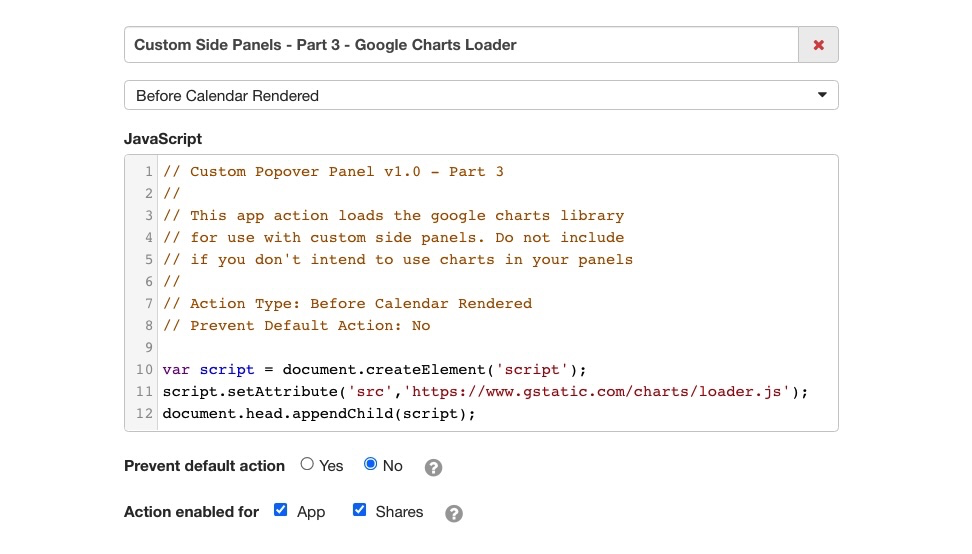
Our examples also use Google Charts in our side panels. For our examples to load, you will also need to install Part 3 of the app action which loads the Google Charts code library.

If you do not intend to use Google Charts in your final product, simple switch off Part 3 after you have finished configuring your panels. This will remove the unnecessary loading of the Google Charts library and speed up the site.
Customizing Your Side Panels
Once your basic example is running, please use the following guide for the customization of your side panels.
Supported Row Types
- Headers
- Headers let you add a title to your tooltip or group related information together
- Label and Value Rows
- Display field descriptions together with field values in structured columns
- Freeform Text Rows
- Display text data, images, maps, or graphs into text rows by adding custom functions that return plain text or HTML
- Separator Row
- Add a horizontal line that groups related information
- Progress Bar
- Display a progress bar for any data value that you’d like to visualize
Define Multiple Panel Types
You may have multiple custom panels and set a restriction that will show a specific panel only for a given user or if the event meets certain conditions.
The app action will scan the panels you’ve defined in the order in which you have defined them and will add a button to the bottom of the Event popover that will display the first applicable tooltip that is permitted by the restriction rules that you have defined.
Automatic Opening:
You can have the panel open automatically as soon as the event is clicked, or let the user decide when they’d like to view it.
Simple Example:
This basic panel has no restriction rules and shows the current status of an event when the user clicks the panel button. Since no restriction rule has been specified, the panel will display all events in the source:
inputs.tooltips.default = {
    content: "Status: " + event["status"]
};
Required Fields
- content – a free-form value containing plain text/HTML
- Text will be displayed in DayBack’s default style. If you’d like formatted rows, specify a rows parameters instead.
– or –
- rows – An array of row definitions (see row types below).
inputs.panels.default = {
    rows: [
        { ... },
        { ... },
        { ... },
    ]
};
Option Fields
- className – Optional – You can have multiple styles. If you do not specify a style, this app action will use the style customPopoverPanelDrawer.
- restriction – Optional – an object containing restriction rules or a javascript function that returns true if the event meets certain criteria. By default, a panel will display for all events and users in a given source, but you can define a set of custom rules that restrict the panel to a specific set of criteria. Rules can be specified as an object containing a list of criteria or as a function that must return true if all conditions match:
// Example 1:
//
// Restricts tooltip to Pending events
// in Technology calendar with custom
// field Project Type set to "Bug Fix"

restriction: {
    status: 'Pending',
    schedule: 'Technology',
    projetType: 'Bug Fix'
}

// Example 2:
//
// Example uses a function to restrict to
// two statuses: Pending, or In Progress

restriction: function() {
    return restrictToStatus('Pending') || restrictToStatus('In Progress');
}
// Delay tooltip display by 1 second
tooltipOptions: { delay: 1000; }Row Types and Parameters
- header – Displays a panel header or title.
- text: your panel header text.
- class: optional class to apply a custom style.
- labelValue – Displays two columns with right-aligned labels and left-aligned values. Accepts an optional 3rd parameter to define a custom style. The built-in custom style ‘textRight’ can be used to align values to the right. This is useful when displaying numbers or currency.
- label: The text of the label.
- value: The text of the value, formatted as you would like it. For numbers and currency, you can use the built-in formatCurrency() function takes an optional currency sign and a number:
- formatCurrency(‘$’, ‘1234.00’) // Returns $1,234.00
- formatCurrency(”, ‘1234.00’) // Returns 1,234.00
- class: optional class to apply a custom style to the value columns
- rowClass: Optional class that determines if rows should display or bottom
- labelSize: Specify a number 1-12 for column size. By default, both label and value are six columns each
- valueSize: Specify a number 1-12 for column size. By default, both label and value are six columns each
- textRow – Displays a full-width row:
- text: The text can be anything, including custom HTML that displays objects like maps and charts.
- class: optional class to apply a custom style.
- progressBar – Displays a progress bar indicating. Accepts three parameters:
- title: Text title of the data being reported.
- scale: Maximum value that defines when the item is 100% complete.
- value: Current progress on a scale of 0 to ‘scale’
- separator – Shows a horizontal line between rows.
- class: optional class to apply a custom style.
Referencing Custom Fields
It’s common to display custom fields you mapped in your datasource. To deference a custom field by name rather than a numerical ID, you can call the getCustomFieldValue() function. Here’s an example of showing a Label Value row for a custom field with Store in Field Name of “billingStatus”:
rows: {
    labelValue: {
        label: 'Billing Status',
        value:  getCustomFieldValue('billingStatus')
    }
}
Special CSS Classes
You can add our custom utility class to any class list:
- textRight – Will align the cell contents to the right.
Conditional Rows
You can show/hide specific rows within a single panel by adding a restriction check to any row. A row will show if you have not specified a restriction check. If you specify a restriction, your function must return true if the row is to be displayed and false if it is to be hidden.
Below is an example of how to use restriction functions. In this example, we will display the project start time if the project Status has been marked as started. We will show an Invoice Number if the project is in Invoicing or Complete status, and we will show a Paid Date if the project was marked Complete:
inputs.panels.projectInfo = {
    rows: [
        {
            type: "header",
            text: "Project Info"
        },
        {
            type: "labelValue",
            label: "Started Time",
            value: getCustomFieldValue('customFieldEventStartTime'),
            restriction: {
                status: 'Started'
            }
        },
        {
            type: "labelValue",
            label: "Invoice Number:",
            value: getCustomFieldValue('customFieldEventStartTime'),
            restriction: function() {
                return restrictToStatus('Invoicing') || restrictToStatus('Complete');
            }
        },
        {
            type: "labelValue",
            label: "Paid Date",
            value: getCustomFieldValue('customFieldBillingStatus'),
            restriction: {
                status: 'Complete'
            }
        }
    ]
};
Advanced Row Types
We provide sample code for making a Pie Chart using Google Docs and adding clickable buttons. The buttons are combined with the showTooltipRowOnBottom and shoTooltipRowOnTop CSS classes, allowing you to move the buttons closer to the mouse depending on where the tooltip is displayed. To call a custom function and display the result, use a standard textRow definition and set the text to the return value of the function:
textRow: {
    text:   makePieChart(),
    class:  'myPieChartClass'
}

textRow: {
    text:   makeCustomButtons(),
    class:  'myPieChartClass'
}
If you are planning on using the Google Charts API to create custom data visualizations in your tooltips, you must first pre-load the Google Charts API javascript library by adding the following code to your Before Calendar Rendered app action:
var script = document.createElement('script');
script.setAttribute('src','https://www.gstatic.com/charts/loader.js');
document.head.appendChild(script);
Editing Custom Fields
We have also provided an example of creating a Select Box from a Custom Field. The function will automatically populate your Select box with options from your custom picklist field mapping. You can then specify a function that should run when the checkbox is changed. The function can update the editEvent object and also run any extra code that should fire when the select box is changed.
{
    type: "labelValue",
    label: "Phase",
    value: makeSelectBoxFromCustomField({
        customFieldName: 'projectPhase',
        onChange: function (value) {

            // Update the event's custom field value
            // after the select box has changed. This is
            // a great place to add any permission checks,
            // or also trigger other changes when values
            // change from one to another

            setCustomFieldValue("projectPhase", value);
        }
    }),

    // Make the label column 'Phase' 4 units wide
    // And the select box 8 units wide

    labelSize: 4,
    valueSize: 8
},
Post-Render Functions
If you need to run custom code after a panel has been rendered, such as our example of showing a Google Chart, you can register a custom function that will run after the panel content has been rendered. There is no return value for the post render function.
postRenderFunction: function() { .. }Advanced Example
Here’s an example of how to configure a side panel like one with the Google Pie chart.
Example Configuration:
You can also define a drawer that only appears for events that have a reminder type set to “Check-in”. It then calls a custom function to return HTML that loads the drawer.
inputs.tooltips.checkin = {
className: "customPopoverPanelDrawer",
autoOpen: true,
restriction: function () {
// Check that Custom field Reminder Type is set to "Check-in"
const reminderType = getCustomFieldValue("reminderType");
return Array.isArray(reminderType) &&
reminderType.includes("Check-in")
? true
: false;
},
rows: [
{
type: "header",
text: "Account Profile"
},
{
type: "textRow",
text: makeCustomButtons(),
restriction: { status: "In Progress" }
},
{
type: "labelValue",
label: "Licenses",
value: formatCurrency("", "1260"),
class: "textRight"
},
{
type: "labelValue",
label: "Annual Rev.",
value: formatCurrency("$", "362260", 2),
class: "textRight"
},
{
type: "labelValue",
label: "Current Budget",
value: formatCurrency("$", "102260", 2),
class: "textRight"
},
{
type: "header",
text: '<img src="https://seeklogo.com/images/J/jira-logo-C71F8C0324-seeklogo.com.png" style="margin-top: -5px; height: 15px; width: 15px; text-align:middle; vertical-align:middle"> JIRA: Priority Cases '
},
{
type: "textRow",
text: '&nbsp;&nbsp;<img src="https://seedcode.atlassian.net/rest/api/2/universal_avatar/view/type/issuetype/avatar/10303?size=medium"> Resolve report issue'
},
{
type: "textRow",
text: '&nbsp;&nbsp;<img src="https://seedcode.atlassian.net/rest/api/2/universal_avatar/view/type/issuetype/avatar/10311?size=medium"> Upgrade booking system'
},
{
type: "header",
text: "Allocation"
},
{
type: "textRow",
text: makePieChart()
}
]
};Example Custom Functions:
The makeCustomButtons() function creates two buttons makePieChart() function returns a Google Chart.
    function makeCustomButtons() {
        // Example function of how to make buttons for opening external links
        return '<center> \
        <button class="btn btn-sm btn-primary dbk_button_primary" onClick="window.open(\'https://...');">Open Cases</button> \
        <button class="btn btn-sm btn-secondary dbk_button_primary" onClick="window.open(\'https://...');">Track Time</button> \
        </center>';
    }

    function makePieChart() {
        // If you are planning on using the Google Charts API to create
        // custom data visualizations in your tooltips, you must first
        // pre-load the Google Charts API javascript library by adding the
        // following code to your Before Calendar Rendered app action:
        //     var script = document.createElement('script');
        //     script.setAttribute('src','https://www.gstatic.com/charts/loader.js');
        //     document.head.appendChild(script);

        return '<div id="chart" style="width: 100%; height: 125px; padding: 0px; padding-left: 5px; margin: 0px; margin-top: -10px;"></div>';
    }
Example Post-render Function to Create Pie Chart:
postRenderFunction: function () {
    google.charts.load("current", { packages: ["corechart"] });
    google.charts.setOnLoadCallback(drawPieChart);

    function drawPieChart() {
        var data = google.visualization.arrayToDataTable([
            ["Task", "Hours per Day"],
            ["Operations", 60],
            ["Marketing", 30],
            ["R & D", 20]
        ]);
        var options = {
            pieHole: 0.3,
            pieSliceTextStyle: { color: "white" },
            chartArea: {
                left: 0,
                top: 0,
                width: "100%",
                height: "100%"
            },
            legend: {
                position: "right",
                alignment: "center",
                textStyle: { color: "white", fontSize: 8 }
            },
            backgroundColor: "transparent",
            width: "100%",
            height: "125px",
            color: "white"
        };
        var chart = new google.visualization.PieChart(
            document.getElementById("chart")
        );
        setTimeout(function () {
            chart.draw(data, options);
        }, 100);
    }
}

Leave a Reply